My last post introduced a simple ‘PageRank’ methodology to rank football teams, using goals as ‘votes’ to spread team strength around the graph. At the end I highlighted a few potential improvements to take things to the next level. Here I will build on one of these: evaluating the model.
Scoring the model
In order to assess if changes to the model are improving it, it will be useful to have some metric by which to measure its success. My initial attempt at doing this will use bookmakers’ odds as my ‘ground truth’. The reason for this is that I believe their predictions are as good as my model is ever likely to get (currently), thus any deviance from their predictions is likely due to my model not being as powerful as their’s, rather than the other way round! I will not use actual results as my ‘ground truth’ for now, since there is too much randomness in final scores. The bookmakers’ odds are steadier.
For each match, I have bookmakers’ odds for a home win, a draw, and an away win. I will convert these into percentage chances, and combine these in a weighted average to result in a score between -1 (away win 100% likely) and +1 (home win 100% likely). To illustrate with an example, for Tottenham vs. Aston Villa on 14th May 2014, we had the following odds:
Converting to percentages, these imply a 67% chance of a home win, 22% chance of a draw, and a 13% chance of an away win. Note how the odds add up to over 100% – this is how the bookmaker weights the odds in its favour.
Thus combining these as ( (0.67 x 1) + (0.22 x 0) + (0.13 x -1) ) / 1.02, we get 0.52. On our scale of -1 to 1, this looks like something between a draw and a home win is most likely. The reverse fixture, by the way, with Aston Villa playing at home, leads to a bookmaker’s combined score of -0.23, suggesting a draw is more likely, or possibly an away win.
So, we have a bookmaker’s prediction for each game – how will we compare our own scorerank model output with this? We must ensure that the model only uses previous, historical, games to make its prediction (i.e. no games from the future!), and ultimately outputs one number. For now, I will use the difference in scorerank between the two teams, for a graph constructed using one season’s worth of historical games. The scorerank differences (home team scorerank minus away team scorerank) can then be correlated with the bookmaker’s combined value we have previously calculated. Note that there is no reason for these values to be the same (they are not normalised), but we do expect some sort of correlation between many pairs of values. Therefore, the R2 coefficient of determination will be my accuracy measure.
Results
To align with my previous blog, I have considered the 2013-2014 Premier League season only, for now. For each match, I look back over the previous 380 Premier League games on record (i.e. the previous season’s-worth of games, so these do stretch back into 2012-2013) and build a ScoreRank model using this data only. This ScoreRank model is then used to determine the difference in strength between the two teams in question, and this value is stored along with the normalised bookmaker prediction (as described above, for now just uses Bet365). Note that I don’t start making predictions for promoted teams until 3 games into the season, as there is not enough historical data otherwise for these particular teams.
The ScoreRank vs. Bookmaker pairs are collected for the whole of the 2013-2014 season, and these values are plotted below. The R2 coefficient is 0.82 – not a bad correlation for this basic ScoreRank model. Perhaps this is a similar model to that which Bet365 use themselves?
From here-on, any changes I make to the model can be evaluated by how this R2 value is altered (and hopefully increased). And once I believe it is high enough, I can then start predicting actual scores, rather than just trying to replicate the bookies’ predictions.
NB – this entry (and potentially series of entries) is somewhat a record of ‘things I’m trying out’, written as I work, rather than a neatly summarised set of findings!
Back in 2013 I tried to make an app to predict football match results, to see how my comparisons would compare with the bookies. The previous ‘X’ results (including their goals, shots on target, etc.) for each team was a strong predictor – but something I found hard to model at the time was a purer measure of ‘team strength‘.
I’ve decided to revisit this problem and use a PageRank-like algorithm in my approach. Similar work has been carried out for NFL teams (see here), and doubtless in various other places too. This type of work can be useful in particular when teams from separate leagues play one another (for example in a cup competition) – in this case, the teams are unlikely to have met before, whilst each team won’t have played similar opponents recently either: it’s therefore difficult to compare their strength directly. However, by joining all teams in a graph structure, we can potentially calibrate the strength of two leagues based on the small number of teams who have played one another in recent history.
Initial approach – treating goals as ‘votes’
Taking inspiration from the NFL work, my first attempt will count each goal scored by Team A against Team B as a ‘vote’ from Team B to Team A, in acknowledgement of the goal. The ‘pagerank’ (which I will call ‘scorerank’ for clarity from here-on) for the graph is intialised equally across all teams at first (each team has scorerank=1 to begin with). It is then iteratively distributed around the graph according to these ‘votes’ (i.e. goals). Thus Team X, who have conceded 50 goals over the season, will send its scorerank out in 50 ‘votes’ of 0.02 each, proportioned to the other teams according to how many goals each of them scored against Team X. Simultaneously, Team X will also receive votes from the other teams according to how many goals it scored against them in reply. On top of this, a fraction of the scorerank is randomly distributed across the graph at each iteration (see ‘random surfer model’ section of original paper for details).
To start things off simply, I have used data from the 2013-2014 premier league season. A graph of 20 teams has been created, and all goals scored across all 380 games have been added as (weighted) edges to the graph between teams. The algorithm then iterates over this.
Firstly, let’s visualise the final graph (after 10 iterations) to provide a better idea of what’s going on. The sizes of the nodes represent how much scorerank – or team strength – has been attributed to each team, based on its incoming scorerank (i.e. goals scored) and outgoing scorerank (i.e. goals conceded). The colours also represent team strength in proportion to the size of the node. The edges between the nodes represent the ‘movement’ of scorerank / team strength, with the heavier lines showing where more goals have been scored (the thicker end of the edge shows the direction of scorerank movement). Looking at Everton for example (towards the bottom of the figure) we can see that they scored lots of goals against Fulham (7 goals in 2 games, in fact) but conceded lots against Liverpool (also 7 goals in 2 games). We can see that Manchester City in particular scored lots of goals in the 2013-2014 season, with many heavy arrow-heads pointing towards it. Their scorerank reflects this (seen in the size of the node), as does the fact that they were the overall champions, with Liverpool a close second.
Scorerank graph after 10 iterations, using goals as votes
How can we evaluate how well the algorithm performs? A first port of call could be the league table (they do say that ‘the league table never lies’, dubiously). The following chart shows the relative ranking for the scorerank model versus the final premier league table.
The scorerank model accurately portrays the top five teams in the table. Below this there is a reasonably strong correlation between scorerank and final league position, though not a perfect alignment. The current algorithm suggests that Norwich, Hull and Crystal Palace should have been relegated (lowest scorerank values along the y-axis) whereas in reality it was Norwich, Fulham and Cardiff that were relegated.
Using this figure it is hard to say whether scorerank reflects team quality any better than the final league table does – perhaps a better way to measure success would be to use the model (built on historical data) to predict score outcomes (from future games). The premier league table could be used as an alternative ‘model’ to predict score outcomes, and we can compare which methodology performs better.
As a final thought on this initial iteration of the algorithm, let’s look at how the scorerank converges. The graph initially starts out with a scorerank of 1 for each team, as previously noted. In the first iteration, this is distributed around the graph. The second iteration repeats the process, but since the starting scoreranks are now different (not all equal to 1) the distribution will shift again. This process can be repeated as many times as we need to, before the chart stabilises. The following chart shows the scoreranks over each iteration:
So we can see that by iteration 3 or 4, the scorerank has actually pretty much converged already, and we don’t need to perform more iterations than this (an important finding if the graph is much larger and takes significant amounts of time to process). The reason that this converges so early is due to the high density of the graph – almost all teams are connected to all other teams (since everyone has played everyone twice, and teams are connected once they score). Thus scorerank is distributed around the graph very quickly. On the other hand, let’s take a look at the same algorithm run on the first 20 games of the season only:
The graph is obviously much sparser, and the scorerank takes longer to converge. As I progress this will be something to be aware of: should I connect different leagues through a small number of matches (i.e. multiple densely connected clusters joined up sparsely in an overall graph) I may have to run many more iterations to allow the scorerank to ‘seep’ through the graph.
Improving the model – some thoughts
The work carried out so far is useful to get some code in place and see how things work. A few thoughts on how this can be improved:
At the moment, a ‘poor’ team that draws 0-0 with a ‘good’ team does not get recognition for this, as no ‘votes’ are sent from the good team (with high scorerank) to the poor team team (with low scorerank), because no goals were scored. We really want a way to acknowledge a ‘no-score draw’. Equally, should we be counting an 8-0 victory as double the number of votes as a 4-0 victory? Teams often take their foot off the gas once they are safely ahead, so perhaps there shouldn’t be so much difference. One potential improvement would be to set a fixed size of ‘vote’ per game, and split this vote according to the outcome. If this fixed size were ‘1’, a 0-0 draw would mean 0.5 votes moving each way, as would a 3-3 draw. A 2-1 win would mean 0.33 moving in one direction, and 0.67 in the other direction.
Home and away performance are often very different for each team. It would be desirable for the model to take this into account. One potential solution would be to have two nodes per team, one being ‘Team-Home’ and one being ‘Team-Away’. Other options might involve weighting votes according to which team is at home and which is away, though this would potentially get messy (and won’t model the fact that some teams are particularly strong at home/away compared to other teams).
It is well known that goals themselves aren’t actually a great indicator of team strength. Football is such a low scoring game – typically only a couple of goals per match, that randomness plays a big part. A significant amount of work points to the fact that shots, and in particular shots on target, may be a more reliable indicator of team quality. The model could therefore use shots on target rather than goals, or in addition to goals, to model team strength.
Currently we are modelling ‘strength’ alone using scorerank, where goals scored and goals conceded are weighing against one another in calculating a team’s strength. The model may be able to say Team A has scorerank=1.2 and Team B has scorerank=0.9, thus Team A would be favourite for a victory, but this doesn’t say whether a match between them is likely to be generally high-scoring (i.e. 5-3) or low-scoring (2-0). However, I would like to predict actual scorelines (rather than score differential between two teams). Thus each node may need two separate measures of strength – one for a team’s strength in attack, and one for a team’s strength in defence. A goal for Team A against Team B would send some ‘strength’ from Team B’s defence value to Team A’s attack value.
Currently the test model described above uses all matches in the Premier League 2013-2014 season to estimate team strength at the end of the season. But in reality we will want to know team strength at any moment in time, based on a set of historical matches. It is likely that more recent games reveal a truer picture of current team strength. We may wish to add a ‘damping’ effect to older matches, discounting votes according to how long ago a match took place. Finding a reasonable damping factor would be a combination of estimation and tuning the parameter within testing. An alternative would be to build several scorerank models, for instance one short-term, one medium-term, and one longer-term, and combining the results (either with hand-picked coefficients, or within a machine learning algorithm).
Measuring success of the model is difficult, but ideally we would like a one number metric to assess the model’s success. This would allow us to tune parameters on a validation set, in order to create the best model possible. I would like to do some work in converting scorerank pairs (for Team A and Team B) into predicted results, or predicted odds, and compare the actual result, or bookmaker odds, with these predictions. This would allow the success of the model to be measured analytically.
Next steps…
I will approach the above improvements in due course and post any findings here! The code for this project so far is available on github.
I have returned to my news visualisation project to create another little web app, which I’m calling ‘Butterfly Effect’ for now. Have a go (click here)!
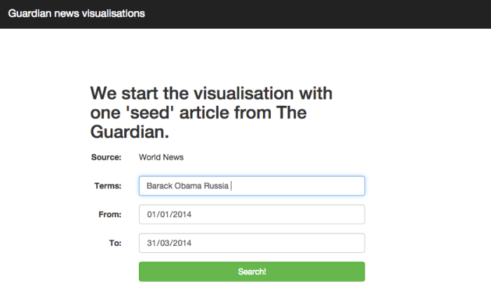
The idea is that a user may pick a ‘seed’ historic news article (using a search function).
Search function to choose seed article
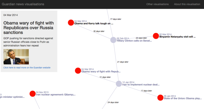
Two or three future stories – leading on from this initial story – are then expanded out in a network structure. From here, the user can continue expanding stories out to see where the initial news story eventually led to. Ideally, the different directions in which the user can expand the news will show a ‘butterfly effect’ phenomenon, as the story branches out in fairly different directions.
Butterfly Effect screenshot
My first attempt at this works reasonably well (though has its flaws!). The challenges were:
Selecting the most relevant articles to show from a seed article chosen by the user, or any subsequent articles clicked on by the user
Attempting to expand the story out in different ‘directions’ at each click (i.e. grouping the related articles sensibly). Thus a story about the London riots may expand along three directions: the clean-ups after the riots, features on causes of the unrest, and the government’s response to the riots. Depending which subsequent line of news the user clicks on, the news articles should move down these routes (and keep expanding into more clusters of related stories)
Selecting the most relevant article within each of the clusters of related articles (each of which heads in a different ‘direction’ as described above) to show to the user. This is subjective, and should depend on article popularity (shares, etc.), the length of time after the initial story, the relatedness to the story, and so on…
Effective visualisation of all of the above
My solutions to these are as follows. My code is written in Python/Flask in the backend, and D3/Javascript on the front-end:
I have found related articles using a cosine similarity measure between every pair of articles, all stored in a sparse matrix. Related articles can be looked up from this matrix at run-time. As more pairs of articles are crawled from the Guardian, each are compared with every other article I’ve crawled. Cosine similarity scores are then added to the sparse matrix, with any score under a threshold rounded down to zero (thus not stored). An improvement to make on this would be to use TF-IDF rather than cosine similarities – but cosines work well enough for now…
The next stage occurs at run-time. Once the user clicks on an article, we wish to show the 2 or 3 of the most relevant related articles, which should not be similar to each other (i.e. we want the story to split off into different directions). We look up the selection of related articles from our sparse matrix as described above (let’s say we find 50 articles stored here). We run K-means clustering on the articles to ‘group’ them into separate subject matters. We group into 2 or 3 groups depending on how many related articles we find.
Out of each of these clusters of articles (each with a slightly different ‘direction’ from the initial article clicked on) we want to find the most relevant to show to the user. For now, I just show the article from this cluster with the highest cosine similarity score to the previous article. However, I really should give each article a relevance score based on this cosine similarity score, the number of days after the initial article, and how popular the article is (data I have from Facebook shares).
I have used a D3 network visualisation, along with my own javascript code, to display the results. The chart wobbles around too much for my liking – and given more time I would like to fix older articles towards the top and expand only in a downward direction.
I’ll be making a couple of the improvements listed above at some point soon – for now though, do have a play and let me know what you think!
Note number 1: this last blog is backdated – I have been unable to publish from China due to firewall restrictions
Note number 2: I have now published a version of this work online – view it here
The last few days I have spent brushing up my MapReduce chops, and having a play with Apache Spark whilst I’m at it. Alongside this I’ve been having a lovely time exploring the beautiful surroundings of Dali, Yunnan, China – spectacular!
As a toy MapReduce project today, I decided to have a crack at making an automatic poem generator, based on content from Twitter. (Inspired by other projects – see list at bottom). I’ve been pleasantly surprised at the results I’m getting after just a few hours. The idea is that a user enters a chosen subject (perhaps with a time range and other preferences), a huge number of current/historic tweets are pulled from Twitter (the API rate limit is the bottleneck here) and then the tweets are rearranged into rhyming couplets to produce ‘poetry’ (or at least, a rhyming list of tweets…)
My first attempt works like so:
Stage 0
Twitter stream pulled by a single machine at user’s request
MapReduce Stage 1 – filter tweets and delete duplicates
Twitter stream sent to multiple Mappers, which filter each tweet for suitability (for example tweets can’t be retweets, must be within a certain length range, must be in English, can’t be @replies, etc.)
(Key, Value) sent to multiple Reducers, where Key=tweet text, and Value=other information extracted, e.g. username, tweet date. The reducers apply a minimum date function to each Key, thus unique tweets are extracted (duplicates deleted), with the first tweet of that content being kept, and all subsequent duplicates tweeted later in time being discarded. This just ensures the first publisher of twitter content is hopefully recognised.
MapReduce Stage 2 – extract rhyme ID for end of each tweet and group by rhyme
Mappers use regex to extract the final word in the tweet, and look up this word in a rhyme dictionary built from http://www.chiark.greenend.org.uk/~tthurman/rhymes.txt). This provides a numerical code for each word in the dictionary, where rhyming words share the same numerical code. I have also written ‘near rhyme’ code (for my separate ‘RhymeTime’ project) though this is not included in this prototype yet.
(Key, Value) is sent to Reducers, one per tweet. This time the Key=rhyme code, and the Value=tweet text, username, tweet date. The Reducers can then package all of the tweets by rhyme code, ready for the final level (where we will choose the rhyming couplets from this list of rhyming tweets). Note that the reducer can count the size of each rhyme group it collects – if there is only one unique ‘last word’ for each tweet in the rhyme group, we can discard the group at this point, as you wouldn’t want two consecutive lines in a poem using the same last word (technically these lines don’t rhyme, despite having the same rhyme code).
MapReduce Stage 3 – pick rhyming couplets from each rhyme group and compile to poem
Mappers need to select two lines from each rhyme group, each line in the couplet ending in a different word. Currently this is done randomly. However, it would be desirable within the mapper to try and link the lines chosen for the couplet by topic, or rhythm, or alliteration, etc. This is discussed below as something I plan to improve.
(Key, Value) is sent to the Reducers. Currently the Key is just the rhyme code (ensuring the rhyming lines are consecutive on the final output).
Being in China, I don’t actually have access to any live Twitter data due to firewall restrictions, but I can use previous data I have collected on other projects for now. The poem below was produced from around 30MB of Twitter firehose filtered by the word ‘Pepsi’…
i like the beyonce pepsi ad
(by AsToldByTella at 2013-08-20 03:16:49+00:00)
i want a pepsi so damn bad
(by KayyyP_ at 2013-08-19 19:48:10+00:00)
my addiction to pepsi is too real
(by RockoYusuf at 2013-08-20 02:13:29+00:00)
pepsi + anything = a complete meal.
(by SanaaNQ at 2013-08-19 23:16:27+00:00)
i want a pepsi… in a can.
(by rhealynee at 2013-08-19 21:18:46+00:00)
just want pepsi and pepsi man
(by SoberIfeelpain at 2013-08-19 19:09:22+00:00)
Considering the simplicity of what I’ve coded, it’s not bad, bar the inaneness of the tweets. More interesting keywords may improve things. I’ve also put through Alice in Wonderland, which works quite nicely!
Technology-wise, I’ve coded each Map and each Reduce in Python, and am currently just testing on my local machine, piping the inputs and outputs between six Python scripts (see my Github). Once I can access a larger volume of tweets, I will attempt to run on a Hadoop cluster with streaming and these same Python scripts. The code can probably be optimised a little – I may not need to send usernames, dates or even tweet text around between each and every Hadoop stage, instead converting to a unique ID once required information has been extracted from the tweet, and just looking up usernames, dates and tweet text up for the few chosen tweets at the end.
Extending the work further, I would like to:
Measure rhythm and scan (which can be done using CMU pronunciation dictionary) to really get the metre correct, and create different forms of poem (sonnets, limericks, etc.)
Improve the third mapper process in picking out the two most appropriate lines from the rhyme-group for each rhyming couplet. These could be picked on content (measuring semantic relatedness between the two lines) or perhaps by linking two different subjects (each alternate line about David Cameron, and Ed Miliband, for instance)
Adding a temporal aspect to things: we could attempt to ensure earlier tweets come earlier in the poem, and later tweets later in the poem. We could then produce a poem spanning Obama’s presidency for instance (filtering by tweets containing ‘Obama’) where the poem describes the presidency (and popular opinion) over time over the course of the poem.
Live poetry(?) – it may be possible to commentate on live events (for example football matches) by finding rhyming couplets in near real-time, and adding them to a page with AJAX…
Creating a user interface to allow anyone to choose a topic and create a poem. As mentioned though, the main issue will be how to scrape tweets from Twitter fast enough (considering API rate limits) to create decent output, before a user gets bored!
As ever, a lot of projects on the go right now, but definitely hoping to extend this fun one a little further.
Note that this last blog is backdated – I have been unable to publish from China due to firewall restrictions.
The last 2 months I have had the ultimate pleasure of travelling around South East Asia and China with my partner Annie, being able to see the sights, have some amazing and unpredictable adventures, work on artistic projects, and work on a couple more pet coding projects. An amazing experience so far, and equally excited for the remaining 2 months.
Coding-wise, my latest creation aims to be a tool for lyric-writers. The inspiration comes from the sometimes-mechanical process I am prone to going through when writing lyrics myself. I may have a lyric pair that is (very much) a work-in-progress, such as:
‘As the winter air became more cold…’
After which, I wish to say something along the lines of:
‘…my heart grew warm and satisfied.’
If I want to make these lines rhyme, with nothing obvious coming immediately to mind, I can look up synonyms of both ‘cold‘ and ‘satisfied‘ in a thesaurus, and cross each of the resulting word lists with each other (i.e. a manual cartesian join), to see if any rhymes or near-rhymes are present. But this process is obviously long-winded, and the type of thing a computer can in theory have a good crack at. Within Python’s Natural Language Processing toolkit there are packages for synonym-finding (Wordnet, for example), and pronunciation (the CMU pronunciation dictionary) which can ultimately be used to assess the level of rhyme between word pairs.
My prototype, given these two lines, will spit out ‘chill & fulfill’ – which could work, perhaps if we switch to ‘chilled‘ and ‘fulfilled‘. It also comes up with ‘disease & appease’ however, as it doesn’t distinguish between ‘cold’ the temperature, and ‘cold’ the respiratory illness. But that’s all work to be done – the user could choose the particular definition for a word, or the system could attempt this automatically (much harder!).
In addition to the functionality I’ve explained above, I’ve spent a good week or more coding a large number of other back-end features and modules, from finding lists of rhymes within a given set of topics, to finding alliterative words, scanning words, similarly-sounding words, replacing all adjectives/adverbs in lines to maximise alliteration and so on… it’s starting to get complex (most likely over-complex, really…).
The main issue that the project has so far is in finding suitable synonyms/related words, given a ‘seed’ word. To find a related word, I initially used Wordnet to find synonyms, homonyms, hypernyms, antonyms, and so on, and then repeat this process iteratively on the result set, to expand the results as far as the user wishes. However, results are mixed – particularly for nouns. For example, typing in ‘fish’ would give you a large number of types of fish, but would not give you the word ‘sea’. Conceptually though, ‘sea’, ‘ocean’, ‘water’ (etc.) would be words you would want thrown into the mix, if you were writing lyrics related to fish, or fishing. Which I’d expect would make a catchy song (a pun generator is on my queued list of projects).
I have attempted two solutions so far, with mixed success. Firstly, I have scraped a large number of English vocabulary lists from the web. The system can then link any two words in the same vocabulary list. Thus a list with ‘maritime’ vocabulary may include the words ‘fish’ and ‘sea’, for example. Secondly, I have measured mutual information between all word pairs in a large corpus, and for each word in the dictionary, saved to a database a short list of other words for which mutual information is highest. This doesn’t result in synonyms themselves, but words that often appear within a short distance (5 words) of one another (weighting down very common words).
The project is becoming large, complex and detailed – so I will save more in-depth descriptions of problems and solutions (and a demo site) for later entries…
As mentioned in my previous post – I headed off to the Netherlands a couple of weeks back for some peace and quiet coding time! Whilst there I learnt the basics of Flask, a Python based web framework, and I’ve just finished putting my first little project.
With a working title of Salt and Pepper, I have made a mini social network designed with those with very little or no internet experience in mind. So, for example, older members of society who wish to stay in touch with family far away, would be able to send messages and photos at the click of a button.
In terms of the technologies used: I’ve used Flask as the framework for the backend, and a little Twitter Bootstrap on the frontend. Most javascipt uses Jquery. The website functionality is split pretty evenly between Flask, and Jquery AJAX calls to the backend. I use MongoHQ for the database, Mailgun to send out email, Dropbox for user-uploaded content, Embedly to resize images on the fly, Google Chrome web speech kit for dictation, and Heroku for deployment. I’m trying Mixpanel for analytics tracking (had been using KISSmetrics in a previous professional role, but really enjoying seeing how Mixpanel works).
Home page (work in progress!)
About page (also a work in progress!)
Logging on to a group
Login page – choosing your username and entering your password
Adding a photo – clear instructions for those who need them
Taking a photo with the webcam
Image posted to the wall (which everyone in your group can see, and add to)
Typing through dictation
Adding an image by typing a description
Images are retrieved (via Bing)
And the image (gif) is posted!
Admins can edit users
As well as add new users
Most importantly of all, you can change your animal
Features that I’ve included so far:
User can create a group
User can then add others to the group (both as an email invitation, or by directly creating a username and password for those without email)
Personalised instructions are then created for each user, in a format suitable for printing
Main user has admin rights to delete users, print instructions for each user, and make other users admin
All users in a group share one main ‘room’ and can post content here
Can post text that is typed in
Can post text that is dictated using Google Chrome’s speech recognition API
Can post an image directly from webcam
Can post an image uploaded from computer
Can post an image based on a description (type a word into the box, a few images from Bing search are pulled to the screen, the user can click which one they wish to post to the group)
All posts have automatically updating relative timestamps
Frequent polling enabling real-time chat
Users can change all details (usernames, passwords, emails, icon)
Daily emails sent to users if new messages have been sent to group since last visit (messaging tailored depending who has sent message, how many messages, how long since user last logged in)
Responsive design
‘About’ pages, T&Cs etc.
It has been a whirlwind experience learning so much so quickly on this, but a hugely enjoyable one. With a little more tweaking (and finalising of a name, etc.) I will push this out there and see how it goes down with real users.
A couple of weeks ago I trotted off to the Netherlands for a week to focus on a couple of projects from somewhere different. I stayed in both Utrecht and Rotterdam, both were lovely.
Utrecht town centreRotterdam is sprawling, this is taken in a central area, from one of the main bridges
My primary mission whilst there was to read and learn everything in:
I haven’t done much web development before, so it was a bit of a self-taught crash course. The book is fantastic (though in latter stages some things started to appear ‘magic’ rather than me fully understanding where things were coming from). I spent about 3 brilliant days reading the book and rewriting the example application presented (a micro blog). I then switched my attention to a project of my own, in order to really practice and explore the things I’d just been learning.
I decided to make a mini social-network, with the target audience being my grandmother (and equivalent…). I once wrote hugely detailed instructions for her on how to send an email (4 pages or so), detailing everything from the plug on the wall to the computer’s on switch, all the way through to pressing ‘send’. They were hugely appreciated. However, in this case, I wanted to make something so simple that absolutely anyone – even those with very little experience with technology – are able to use it right from the word go, and perform more advanced functions with it too (sharing pictures, for example).
A couple of weeks later I’m excited to have just finished a Beta version – which I’ll detail in my next post!
This is a continuation of a previous post which laid out a mini project I’ve spent a few days working on. I have now uploaded a simple version of the app described, which can (at the time of writing…) be found here.
Currently I need to run a manual script to update the news daily, though I will automate this in time.
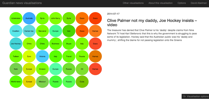
Feb 2014 UK news articles from theguardian.com laid out with PCA and coloured with K-means.
Following on from my last post, today I’ve been experimenting with the idea of laying out news articles in some 2D arrangement whereby articles with similar semantic content are placed close together spatially. For example, one corner of a visualisation may contain articles on Iraq. Following the space horizontally to the left, the content may shift to Afghanistan-related stories, then perhaps to Middle East cultural stories, whilst following the space vertically downwards from the Iraq area may shift to American policy, then on to British policy, then more general UK news, and so on.
This effect may be achieved in various ways. I have played around with highly connected graphs in Gephi (generated from Guardian data) where nodes are connected based on TF-IDF scores calculated in Python (using scikit learn) and on internally-linked content (based on Guardian data). The stronger the links, the higher the edge weight in the graph. The desired result would be that the most similar articles would be forced towards each other based on the network’s physics – although in reality, the results were more visually confusing than exciting. An additional problem with heavy fiddling in Gephi is that the results may be hard to reproduce for users in an interactive way within the browser.
Another avenue I have experimented with has been in forcing some strict grid-like layout. I considered using self-organising maps (something I’ve not looked into before) although to start in more familiar territory, I’ve decided to use PCA as a first pass. The TF-IDF data from a collection of articles (typically 1-10k dimensions, i.e. words) is compressed down to 2D using PCA (i.e. the two components explaining the most variance are selected). Thus articles can be laid out in 2D space like as shown here.
One month of UK-related articles from the Guardian plotted in 2D (using body, standfirst and tags only)
I am not familiar with algorithms to transform this data into a regular N x M grid of data, which is the effect I wanted. To attempt a naive first pass, I have sorted the data into N bands along the first (horizontal) principal component (imagine drawing N-1 lines vertically across the PCA chart to split the data evenly). Then, within each of these bands, I have sorted the data along the second principal component (i.e. vertically). Although this doesn’t guarantee that all adjacent data in the PCA space will be adjacent on the simplified grid, the result should be decent enough to a first approximation. Using Python to wrangle these calculations appropriately, I export my results as JSON, and use D3 to plot in the N x M grid.
Articles in grid format using D
Having arranged our data into a 2D grid as hoped, we still have more visual dimensions to play with. We can edit the colours, and the sizes of the blocks. Data that would be nice to represent in these ways include: discrete topic, popularity of article, pagerank of article, recency of article, and so on.
To deal with topic, I decided to model split topics using K-means (once again with scikit-learn) using full article data. We can then vary the colour with which cluster an article is assigned to. We have obviously already performed something conceptually similar with our PCA (with the results plotted spatially), but it’s interesting to see how well (or not) the K-means and PCA results align. I have also tried to vary colour with cluster centre in a logical way – so clusters centred close to each other have similar hues, and further away have more different hues. (Note I have also added a random element to each block’s hue and lightness, from a purely aesthetic standpoint).
To deal with popularity I have used Facebook’s Graph API to extract ‘like’ and share data for each story. One issue to consider with this is that the number retrieved from Facebook is a static snapshot in time of the article’s ‘likes’ and shares to date – so going forwards this data needs to be collected on a certain day of the article’s lifetime (for example, always Day 3) for intra-article comparisons to be meaningful.
The intermediate result of all of this work is shown in the following screenshots. I plan to make date range selection and tag filtering interactive before I deploy this. Data is always more interesting when it’s interactive.
2D grid, coloured by topic (K-means) and laid out using PCA in 2 dimensions (features were article headlines, standfirsts, and tag metadata). We can see the PCA and K-means roughly agree on topic clustering. The user can hover over articles to read a preview – clicking will take the user through to the theguardian.com website.
The user can open a sliding ‘Options’ window to interact with the data beyond hovering and clicking
For instance, the user can view tags (as provided by the Guardian), and change other visualisation features (not all implemented yet!)
The Python/D3 script scales up to an arbitrarily large (or small) date range. This shows 3 months of UK data. The white square indicates the article over which the user’s mouse is hovered.
Having originally mulled over different ways to visualise news data (specifically, collections of news articles, and how news evolves over time) a year back, I’ve this week started to play with some guardian.co.uk data taken from http://www.theguardian.com/open-platform. I’m currently playing around with its network structure – looking at linked articles, PageRank, clustering, TF-IDF, and so on.
I’ve also started playing with Gephi this morning (having worked through https://www.coursera.org/course/networks and https://www.coursera.org/course/sna over the last few weeks), and I’m blown away! Very easy to import graphs (exported in GraphML from NetworkX in Python) and start playing with structure, colour, layout, and so on.
My first – and very basic – output is a visualisation of news articles published in the 18 months from Jan-2013 to Jun-2014 on guardian.co.uk with the tag of ‘UK news’. I’ve excluded small stories with too few connections. The connections between nodes represent internal links (‘related content’) as defined by the Guardian. There’s obviously a lot more we can do to connect these bunches of content too, ensuring similarly themed bunches of stories are near each other (which they currently aren’t). That’s one of the things I’ll be working on next, before looking at some more useful and interactive ways to display the data…
Zoomed out view of whole network…… slightly zoomed in …
… and zoomed in further. We can see Litvinenko-related stories are inter-connected, as are plane-related stories.